Thursday, April 27, 2017

Modern Quilt Along -- Ombre Popsicle Quilt

April was my month to join in the Modern Quilt Along hosted by Simple Simon and Company. This month's theme was Solids, and I wrote all about them (and my love for them) a few weeks back. I also shared a sneak peek of a solids project I was just starting. Now, I'm excited to show the finished quilt top of my Ombre Popsicle Quilt!
Isn't it cute? The solids are a mix of Konas and Moda Bellas in the springiest of color palettes. Seriously, these colors just make me happy ... and feel like I want a big bowl of sherbet.
The top went together super quickly, and I'll be back with lots more details to share once it's all quilted and finished, but I couldn't wait to show off the top. If you've got a solids quilt of your own, be sure to link it up on the quilt along post over at Simple Simon and Company. They're hosting a giveaway of lots of goodies each month, so feel free to play along!

Wednesday, April 26, 2017

Tall Tales quilt: A finish!

I have another quilty finish to share with you today! Meet the sweet little Tall Tales Quilt.
This quilt holds a special place in my heart because I made it for my new little nephew, who arrived about a month ago. My brother and sister-in-law are both English PhDs, so I knew from the start that I wanted to make their little one a book-themed quilt.
Then, the wonderful Kate Basti released her (free!) Tall Tales block pattern, and the rest was history. The pattern is just a single paper-pieced book, so I made 16 of them and then added borders and sashing to bring the quilt up to about 36" square.
For the book covers, I used mostly Cotton + Steel prints (largely from Kujira and Star, with a little bit of Yours Truly and Flower Shop, along with some C+S basics) with a few other coordinates thrown in. I used an assortment of text and lined prints for the book "pages," and the background fabric (which turned out to be hard to capture accurately in photographs) is a Dear Stella Net print in a lovely icy mint green.
For the backing, I used an older Cloud 9 print that I'd been hoarding for a while. I love that print so much, and it worked perfectly with the quilt. Thankfully, I had some left over (phew). For the binding, I used another print from Kujira. I wanted the quilt to be super light and soft, so I kept the quilting pretty minimal, just some wavy lines spaced randomly.
 
As it turns out, in a stroke of luck, the quilt arrived at its new home the day my nephew arrived. I got all the warm fuzzies when my brother sent me this precious photo of the little guy enjoying his gift. Much as I love it, the quilt is definitely not the cutest thing in this picture. :) Welcome to the family, A!

Monday, April 24, 2017

Florence Flamingo quilt: A finish!

When Elizabeth Hartman released her new patterns last fall, I (like half of Instagram) immediately fell in love with her Florence Flamingo quilt, so when the owners of the quilt shop where I work asked if I'd be interested in putting together a shop sample, I jumped at the chance.
The bulk of the flamingos were made using a jelly roll of Elizabeth's latest collection, Pond. In the original pattern, Elizabeth used a Kona jelly roll for the solids, but I chose nine coordinating Moda Bella solids instead (you need an 1/8 yd. of each if you're going that route). For the background, I stuck with Essex Yarn Dyed but switched to Chambray, a delightful blue that seems to go with almost everything.
While the pattern was generally not difficult, it was time consuming, starting with all of the cutting. See that picture above? Yeah, that's a lot of pieces. And it's a lot of different-sized pieces, which means you have to be very careful about labeling everything and then not mixing it up. I'm happy I now have a sewing space where I can leave my projects set out each night.
There are also a lot of really tiny pieces. Elizabeth generally doesn't use paper piecing in her patterns, which is often a bonus, but there were definitely parts of this pattern that would have been easier with the stability and precision that come with paper piecing (I'm looking at you, knobby knees).
Still, I couldn't help but be happy with this cheery result. Just look at those gals strutting their stuff! The super fun quilting was done by one of the shop owners on their long-arm machine. This was actually the first quilt I'd ever had long-armed, and I gotta admit it was nice to not have to wrangle this one through my machine.
And now everyone gets their beauty shot.
For the binding, I used some of the leftover jelly roll strips to create a scrappy look. The backing consisted of two pieces of yardage from Pond (this and this), with a leftover strip of the chambray Essex in the middle.
She's been hanging in the shop since February, and it's still fun to walk in and see her behind the counter. Strut it, Flo!

Monday, April 3, 2017

Modern Quilt Along with Simple Simon and Company – Solids!

April is here, which means it's time for the next stop in Simple Simon and Company's Modern Quilt Along, and this month, it's all about solids!
When Liz and Elizabeth asked me to be part of the quilt along, I jumped at the chance. It's always fun to take a closer look at what makes modern quilts modern, and using solids is one of my favorites. Sure, there are a million great modern prints out there nowadays, but nothing compares to the freedom that comes from using solid fabrics, not to mention the variety of shades and colors you can draw from.
Seriously. Robert Kaufman now offers its Kona solids in 303 colors, Moda's Bella solids come in more than 200 colors, and many of the other big manufacturers offer hundreds of colors in their solid lines as well. You can even get organic solids from Cloud 9 or Birch Fabrics. With so many colors available, there's no limit to the combinations you can make, whether you're going for a rainbow or honing in on a smaller portion of the spectrum.
Solid fabrics can free you from the trouble of having to find just the right print in just the right shade. You don't have to think about direction or scale and can instead just let the color guide you. Solid quilts are bold and impactful, letting the fabrics speak for themselves.

For my Cascade quilt, I worked with a rainbow palette of 32 colors, mixing and matching until I got just the right combination for my full spectrum.
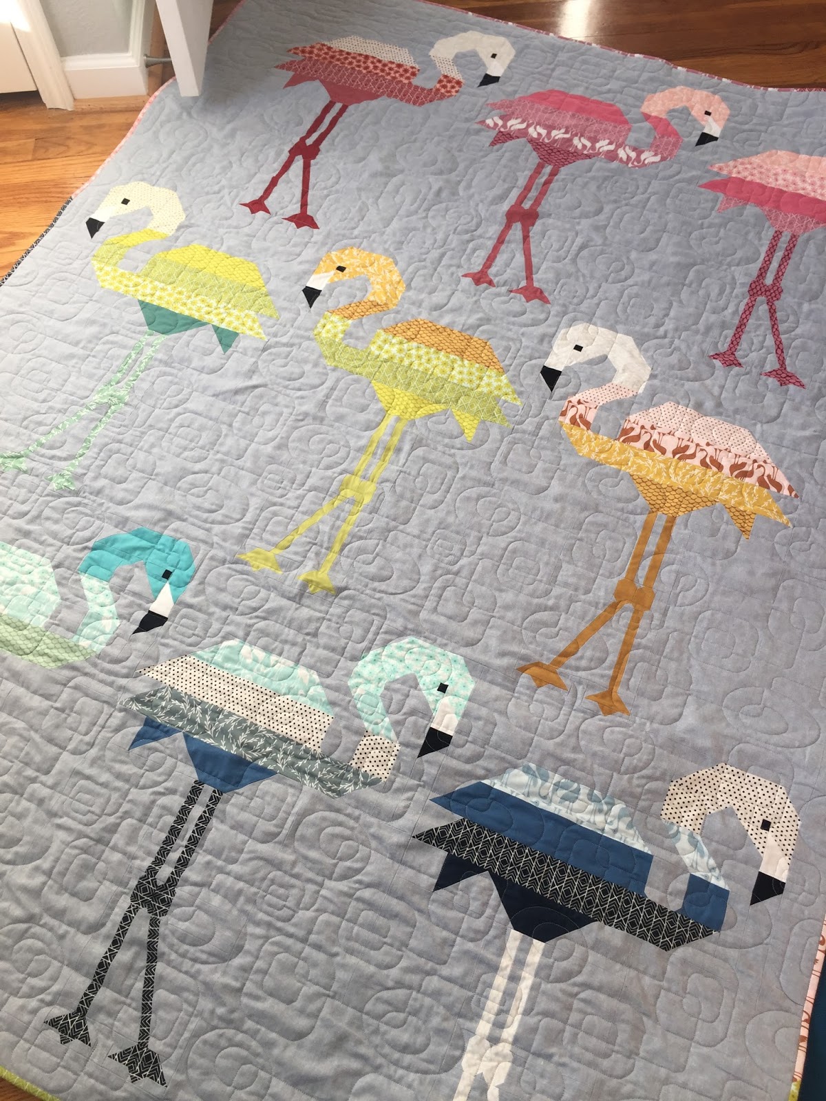
Using solids in my Cut Glass quilt helped to disguise the seam lines and smooth the transitions between the blocks, enhancing the visual impact of the design.
In my Tessellation quilt, I used 25 solids in a more limited color palette of pinks, purples, teals, and blues. This quilt really showcases the range of shades you can find in solids -- 25 shades of just four colors (and, believe me, I could have used a lot more).
Conversely, I scaled back to just three solids in my Fly Away quilt. Here, the simplicity of the design needed to shine, and that impact would have been lost with too many colors or distracting patterns.
When working with solids, it's even more important than with print fabrics to pay attention to the tone of your fabrics. Try to look at your options in a room with good daylight to get the most accurate sense of the hues. Keep like tones with like tones. Colors that have more gray in them will pair best with other colors with a gray tone, for example. And incorporate more tints or shades of a color to show range within a limited color scheme. The hedgehog in the mini quilt below and my Texas Forever quilt after that are good examples of this.
Finally, incorporating small amounts of a print into a mostly solid quilt can be a great way to make both the prints and the solids pop. By using just a few patterned triangles in my Birch Triangle quilt, you see mostly the calmness of the blue and aqua solids, but then your eye occasionally wanders to and settles on one of the patterned fabrics, providing movement and interest without overwhelming the senses.
A few more pro tips for working with solids:
  • Since solids don't have labels on their selvages like print fabrics, when you get a new color, label the manufacturer and color name in the selvage using a Sharpie. It'll save a lot of headache when you try to match it or buy more in the future. Some online shops add sticker labels to their solids, which is so helpful.
  • Keep a list of your favorite solids, especially basics that you use a lot (like your preferred shade of white), for future reference.
  • Try out the solids lines from different manufacturers to find which you like best. Just like printed fabric, solids from different manufacturers can have a different hand and weight, and you may find that some are more or less interchangeable (I often mix Konas and Bellas), while others really work best on their own.
  • The printed fabrics from manufacturers match their solid lines, so if you're trying to pair prints and solids and looking for just the right color, a good starting place is that manufacturer's line of solids. Some manufacturers, like Robert Kaufman, have even started creating bundles of solids that specifically coordinate with their printed collections (for example, here and here).
  • If you find you really like using a certain line of solids, consider investing in a color card, which makes pairing and finding the right colors easier when buying more or sorting through your stash. Consider cutting the card apart so you can move the swatches around more easily when you're putting together a new palette.
This month's theme inspired me to curate this delightfully springy bundle of solids, which I started cutting into for a new project almost immediately. Keep an eye out for the finished piece in a few weeks. I'm excited about this fun quilt!
And if you're looking for more solids inspiration, I recommend checking out these wonderful designers who use solids in inspiring ways in much of their work:
Finally, be sure to head over to the Simple Simon and Company post to link up your favorite solid quilts for a chance to win this month's giveaway! 

Sunday, April 2, 2017

March do.Good Stitches blocks

For the March block for the Emerge Circle of do.Good Stitches, Betsy asked us to play with half-rectangle triangles in a black and lime green color scheme. She was inspired by the patriotic quilt in this episode of Sewing With Nancy.
For these blocks, you piece 1" white strips into a black rectangle measuring 8 x 10", then cut it on the diagonal and pair it with a lime green print (again, 8 x 10" rectangle cut on the diagonal). The only tricky thing is to make sure all of the rectangles are cut on the same diagonal (in this case, from the upper right corner to the lower left corner). These went together fast and were really quite fun.